Oxford Hydrogen.
How Pronto built the complete brand identity, landing page website, and launch graphics for Oxford Hydrogen; a clean energy startup pioneering catalytic hydrogen production.
- 2026
- Climate-Tech
The Challenge
Founded by Andrew Murphy, Oxford Hydrogen had developed a breakthrough catalytic platform for producing clean hydrogen alongside high-value chemical co-products. But strong science alone wasn't enough. The brand needed to inspire the same confidence as the technology.
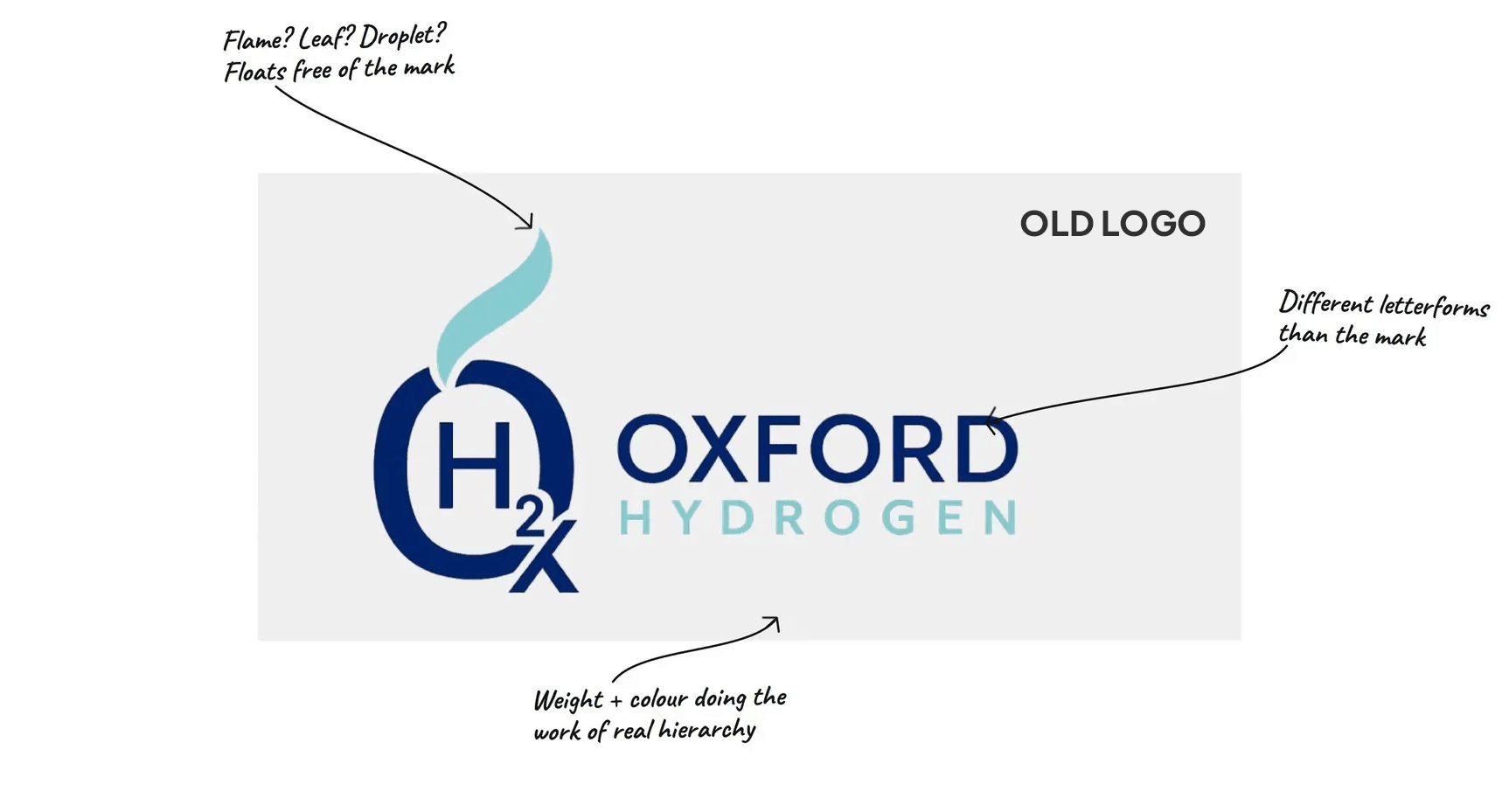
As an early-stage company entering conversations with investors, research partners and the scientific community, Oxford Hydrogen needed to move beyond its DIY identity and placeholder website.
The challenge was to create a credible, investor-ready brand that matched the ambition and innovation behind the business.
The Scope
 Brand Guidelines
 Brand Strategy
 Launch Campaign
 Logo Design
 Visual Identity
 Web Design & Dev
Our Solution
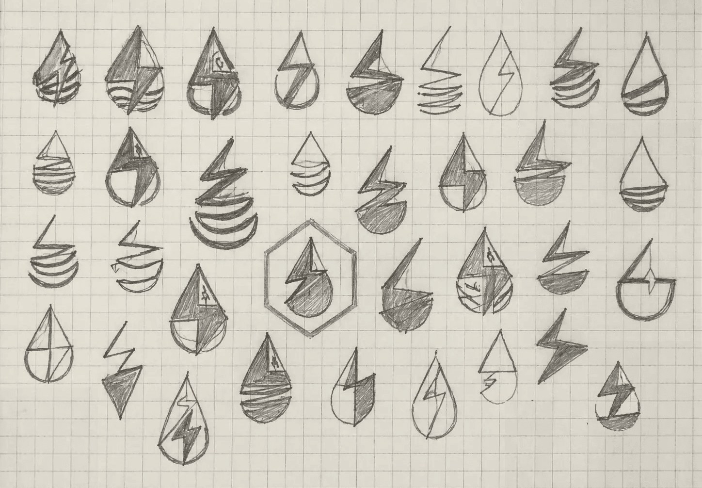
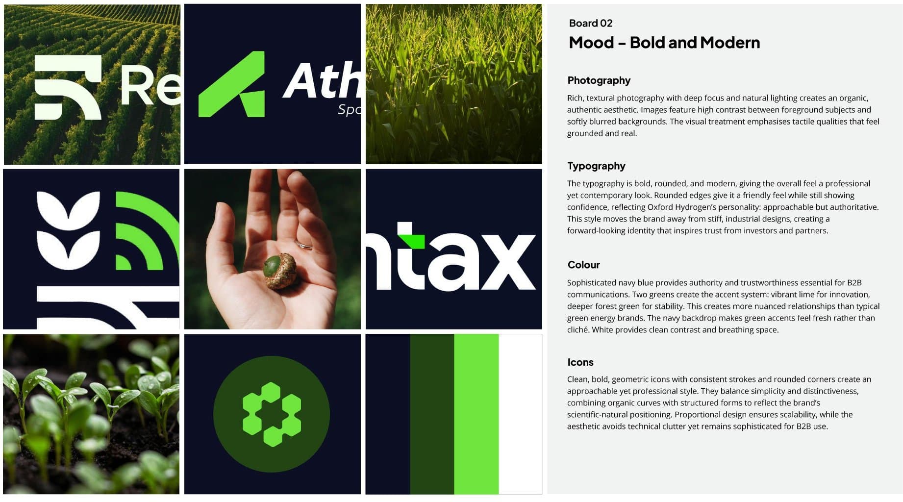
We began by getting under the skin of Oxford Hydrogen, understanding the business, looking at the competitor landscape, the technology and the audiences they needed to connect with. From there, we explored a range of creative directions through moodboards, visual research and early sketches.
This helped us define where the brand could sit within the sector and identify opportunities to create something more distinctive. The goal was clear: create a brand that felt scientifically credible and established, without blending into the conservative visual language of the sector.
Building the Identity
With a clear direction in place, we began shaping the identity around the ideas at the heart of Oxford Hydrogen: clean energy, chemistry and innovation.
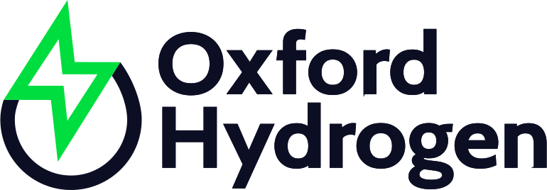
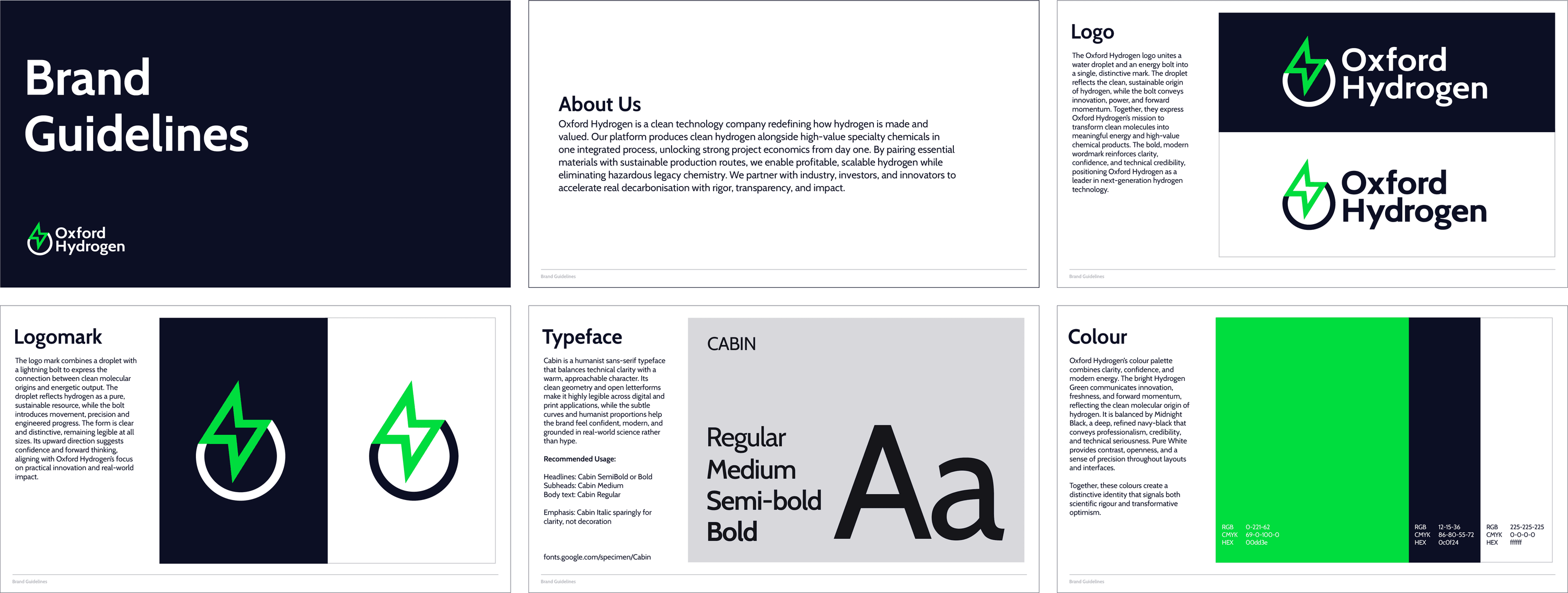
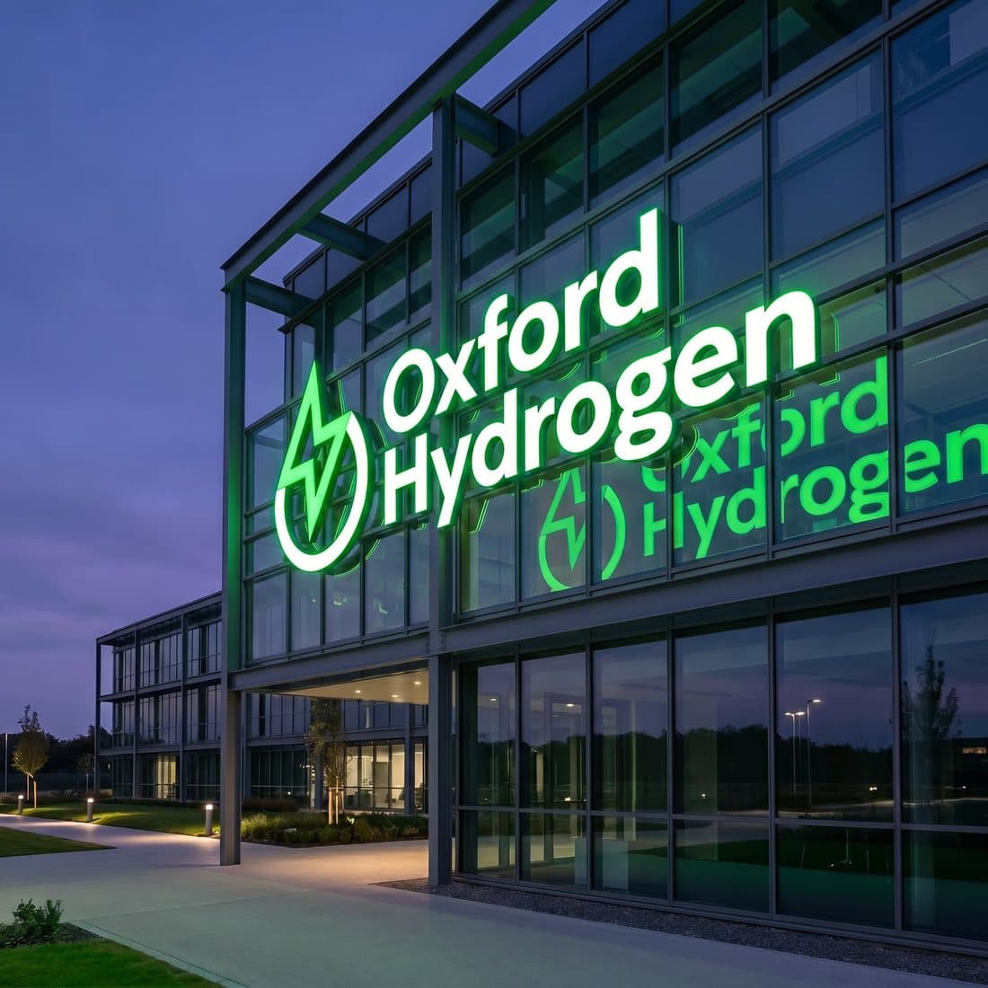
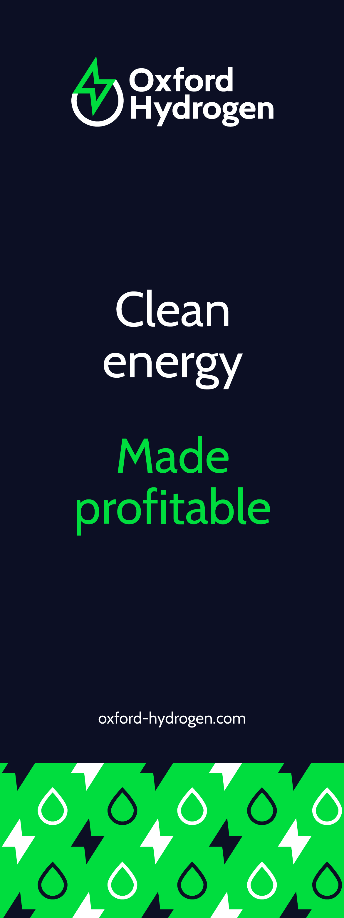
The custom mark grew out of our early sketches, combining references to hydrogen, energy and molecular structures in a simple geometric form. The colour palette followed the same thinking.
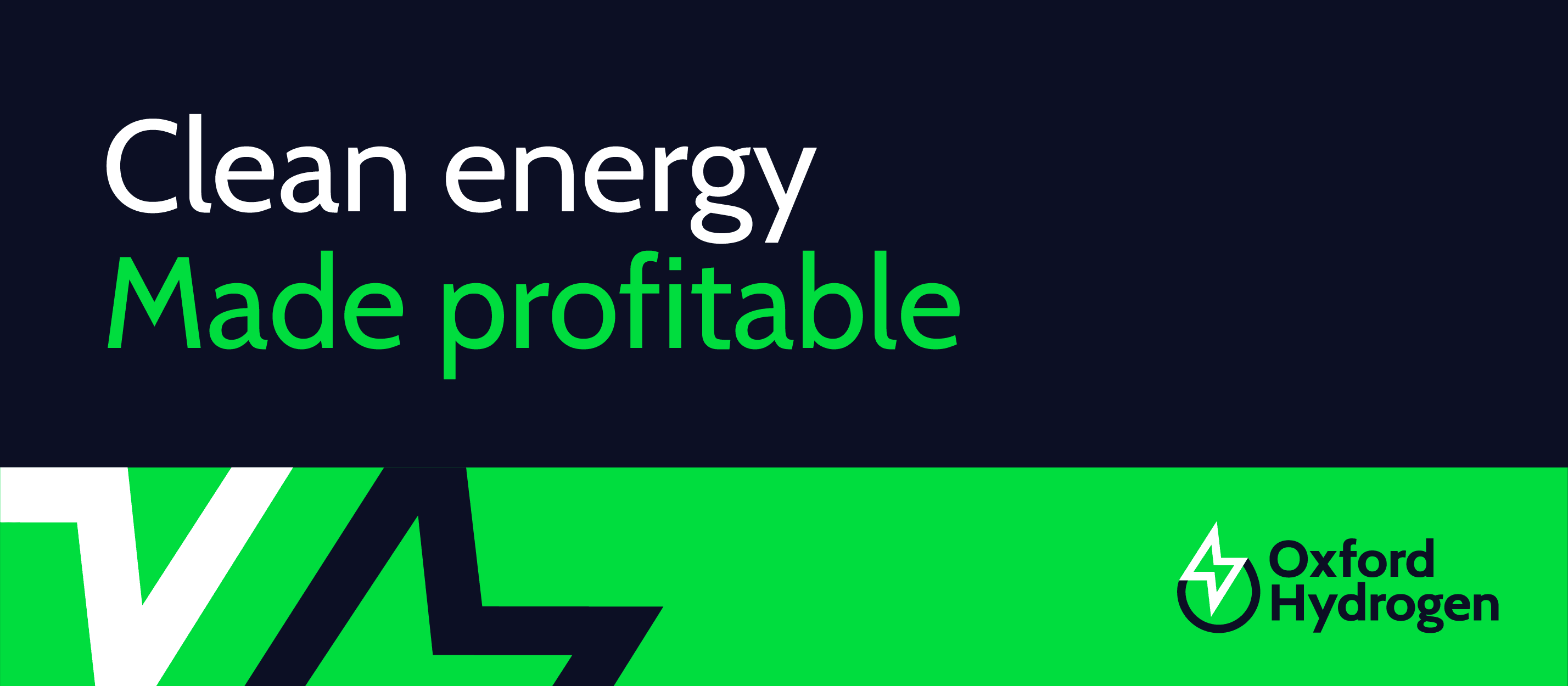
Electric green brings energy and a sense of progress, while deep navy adds the precision and credibility needed in a scientific setting.
The result is a distinctive identity that feels forward-thinking, while still grounded in the science behind the business.



Launching something exciting?
We’d love to hear what you’re building. If you’re looking for a brand that makes a strong impression on investors and grows with your business, tell us a little about your vision.
Start a Conversation →